
You only need
12 slides
to fundraise for your startup.
Made by Landon Howell, who has helped 60+ startups raise $270M in venture funding.
Slide 1
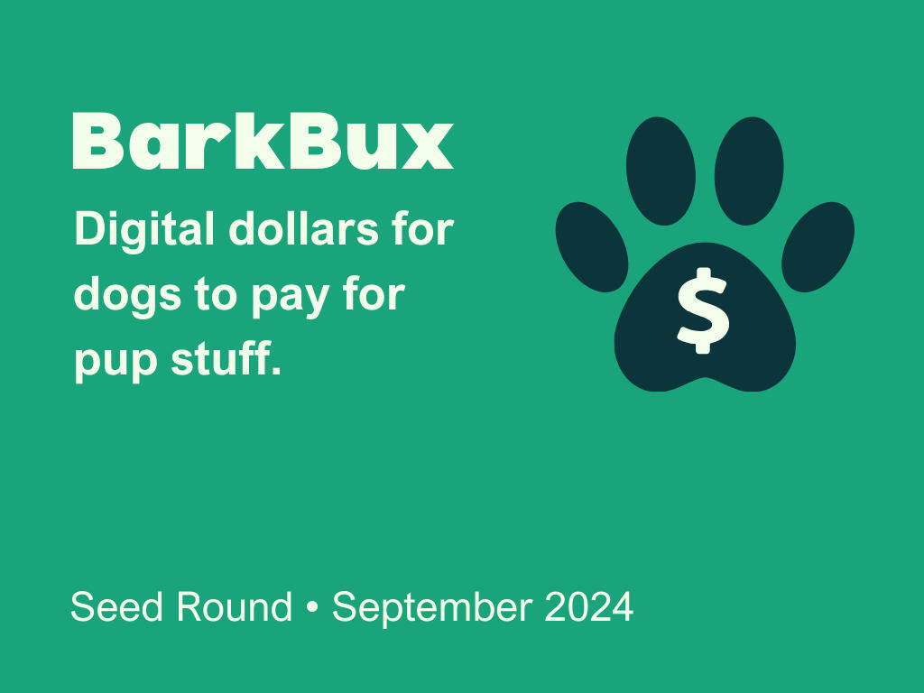
Cover
answer these questions
■ Who are you?
■ Where are you on your journey?
key elements
• Logo
• Positioning Statement
• Round
• Month & Year
Slide 2
Thesis
answer the question
■ How do you see the world differently than anyone else?
key elements
• Your Mission
• Your Vision

Slide 3
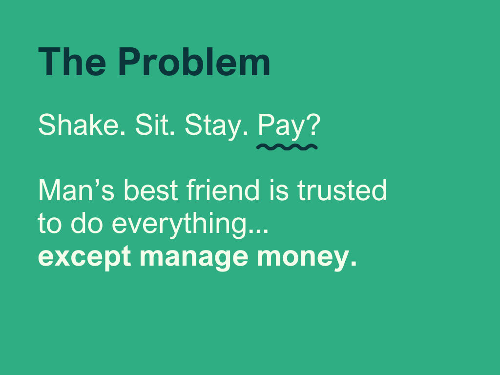
Problem
your goal
↣ Paint a picture of a person in need and help investors empathize with that person.
key elements
• What is the problem?
• Who experiences the problem?
• How often do they experience the problem?
• What are the implications of the problem?
Slide 4
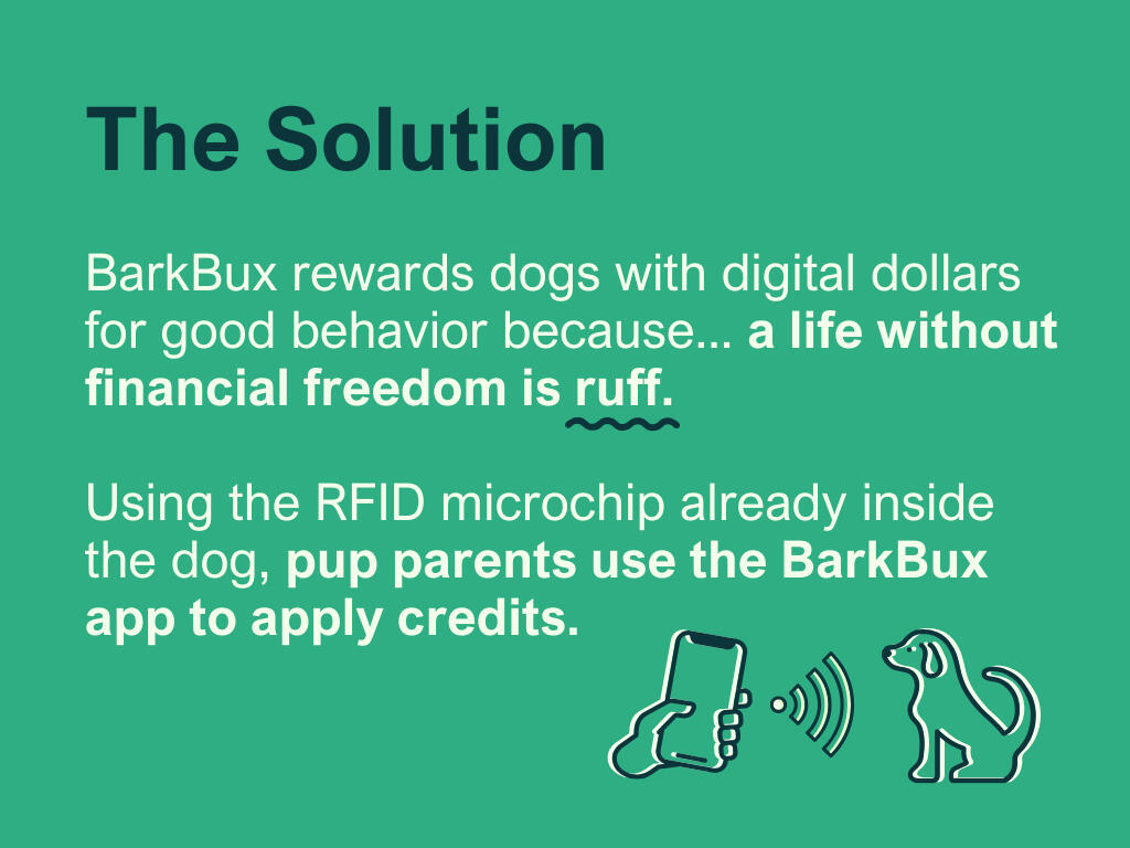
Solution
your goal
↣ Focus more on telling investors what your product does, not necessarily how it does it.
key elements
• Your solution to the problem.
• A product demo, if possible.
tip
▸ Clearly explain what you do in as few words as possible, focusing on the concrete benefits you provide.
Slide 5
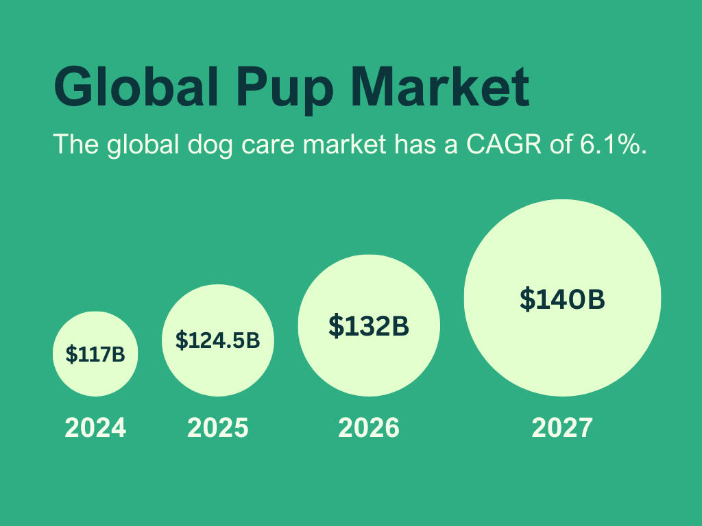
Market Overview
answer the question
■ How did you determine that this is a massive market?
key elements
• Current Size of the Market
• Recent Growth of the Market
• Projected Growth of the Market
tip
▸ The data will never be a perfect prediction, but it should be directional in its accuracy and defensible in a debate.
Slide 6
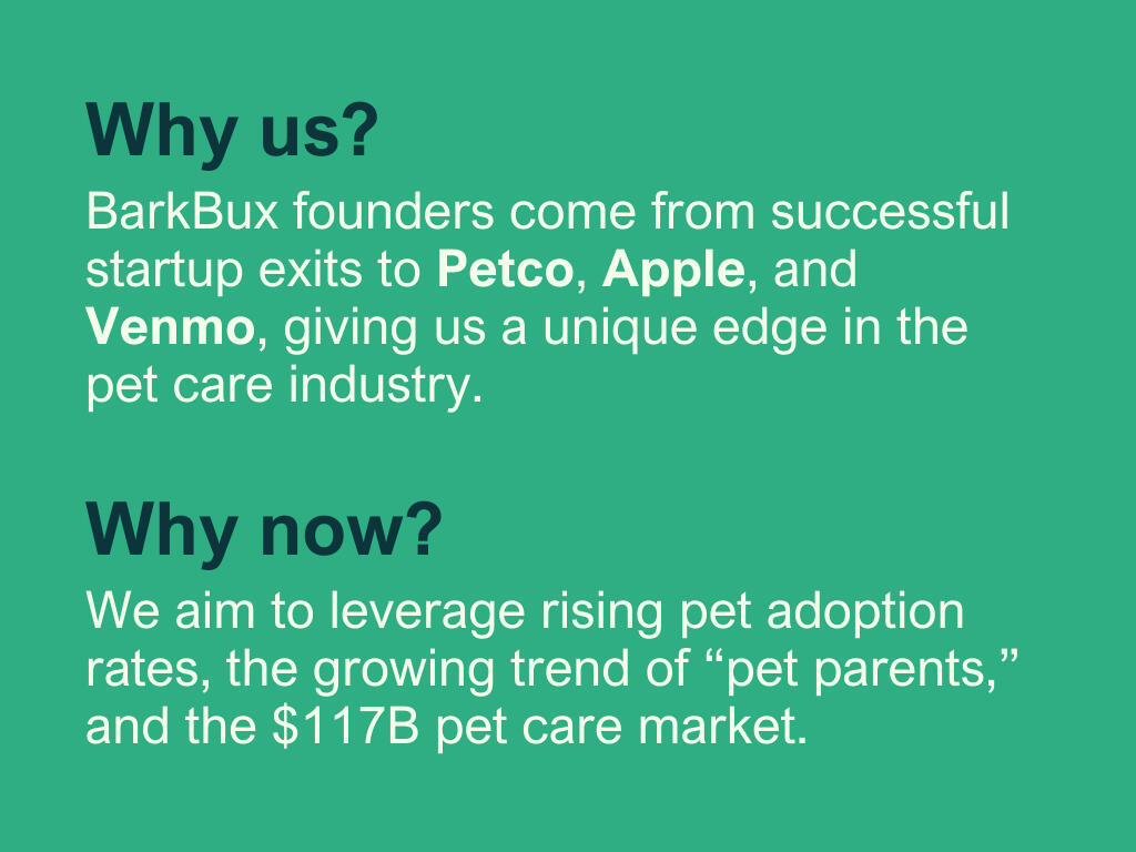
Why You?
Why Now?
answer the questions
■ Why doesn't this already exist?
■ What is your unfair advantage?
■ What is soon-to-be obvious but only recently possible?
key elements
• Trends
• Timing
• Technology
tip
▸ Discuss emerging trends and future projections while substantiating the shifting market dynamics.
Slide 7
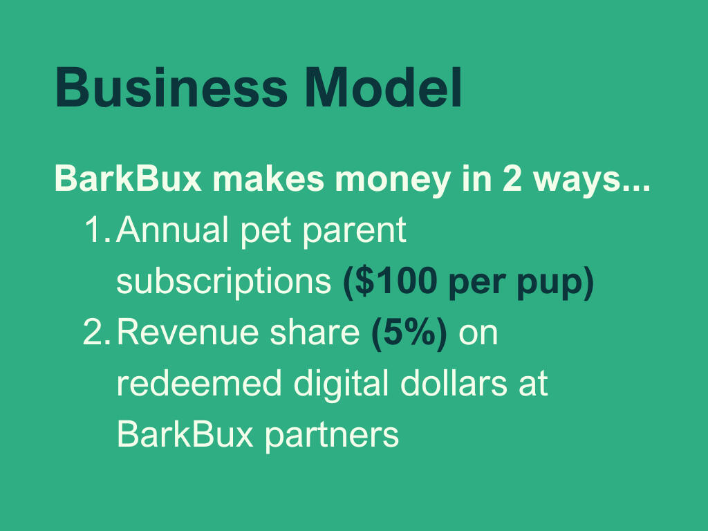
Business Model
answer the questions
■ How do you make money?
■ How did you arrive at this monetization approach?
key elements
• Cost Structure
• Market Demand & Value Proposition
• Competitive Analysis
• Pricing Strategy
• Profit Margins
tip
▸ In a live pitch, be prepared for the question: How did you arrive at this monetization approach?
Slide 8
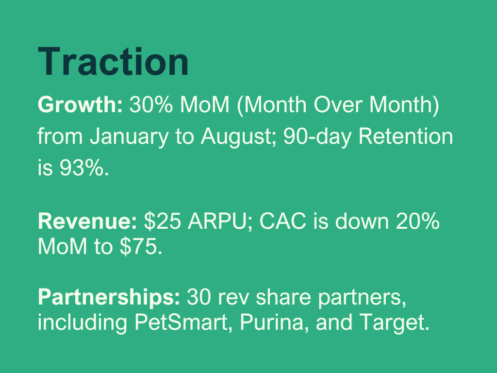
Traction
goal
↣ Show your growth from when you started until now.
key elements
• Growth (Aquisition, Activation, Retention, Referral, Revenue)
• Partnerships
• Key Milestones
tips
▸ Make the numbers clear and meaningful.
▸ Let the numbers brag for you, and give those numbers context.
▸ There are very few reasons to use a chart with cumulative numbers.
Slide 9
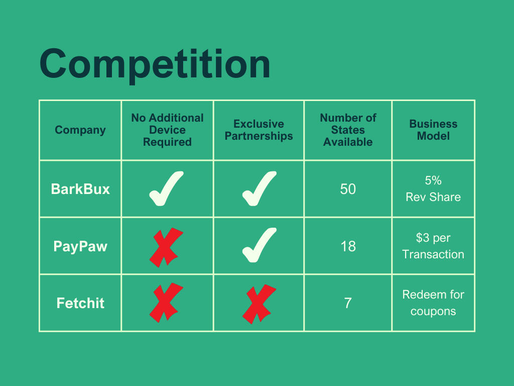
Competitors
answer these questions
• Who are the incumbents?
• Why aren't they fulfilling needs?
• How will they respond to you?
key elements
• Competitor Comparison Table
• Market Positioning Map
• Unique Selling Points
Slide 10
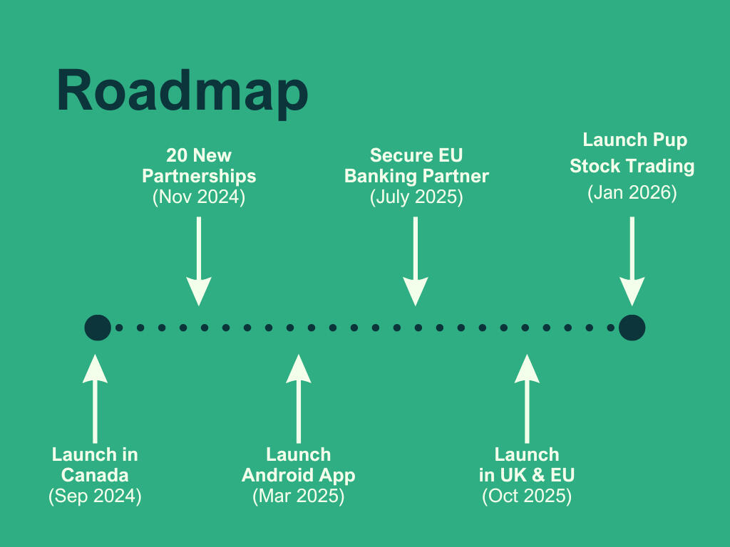
Roadmap
answer the question
■ What will you do with the money you raise?
key element
• Timeline (18-36 Months) for product development, growth initiatives, and team additions.
tips
▸ Avoid staying too high-level or getting too granular.
Slide 11
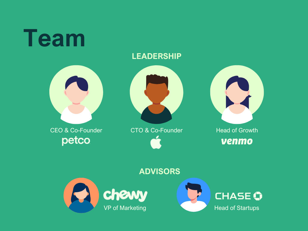
Team
keep in mind
↣ A startup is only as good as the team it assembles.
key elements
• Leadership Team
• Advisors (If Applicable)
• Board (If Applicable)
• Current Investors (If Applicable)
tip
▸ When highlighting individual backgrounds, align their most relevant experience to your company's most important needs.
Slide 12
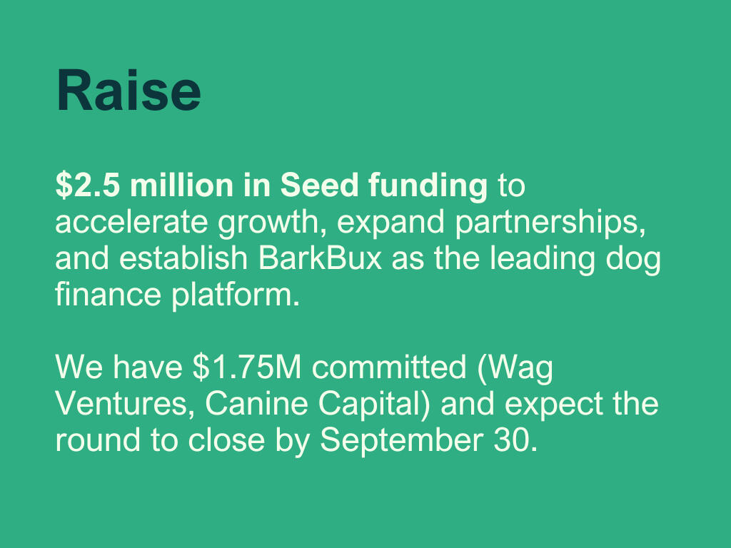
Your Ask
goal
↣ Be specific in your raise amount and convicted in your timeframe to raise funds.
key elements
• What are you raising?
• How will you deploy funds?
• What will you accomplish?
tip
▸ The goal is not to get a next meeting but to get a commitment in this meeting.
🙌 That’s it.
You don’t need a Thank You slide or a Contact Information slide.If they have your deck, they have your email, or you are standing in the room with them, you can thank them face-to-face.
10 Tips
1
The number of slides and structure of the slides is not prescriptive.
Maybe your deck is exactly 12 slides, or maybe it’s a little more, but be brief. Brevity is the result of thoughtful consideration of the slide structure and the number of words.
2
Prioritize substance over style.
A stylish but shallow deck is a bad deck.
3
Your deck should be able to stand alone.
Your deck will make the rounds through a firm. Partners will share with partners who haven’t had the pleasure of meeting you first, so make sure your slides tell the story without requiring your voiceover.
4
Not all stages are created equal.
The bar for a Series A round is much higher than a Seed round. If anything, the survival rate between Seed and A is more punishing now than ever.
5
Your slides should be simple, legible, and obvious.
Slides should be easy to read, straightforward, and communicate ideas at a glance to capture and maintain investor attention.
6
Align with the interests of your audience.
Speak their lingo and highlight hot buttons. Every firm has a thesis published on their website and every Angel has a preference easily found in their tweets.
7
Investors, like founders, are emotional.
Investment decisions stem from emotions; feelings come before reasoning. VCs often consider the visceral potential of a start-up rather than solely its expected rational value. For VC firms, a few key investments can yield outsized returns and define a fund’s success. For individual VCs, identifying these outliers is crucial as backing a major success can define their careers.
8
All projections are wrong, but they need to be directionally correct and defensible.
Danish physicist Niels Bohr said, "Prediction is very difficult, especially if it's about the future." Even the brightest founders fall into the trap of linear extrapolation, assuming that existing trends will persist at the same rate and follow the same path. This leads them to envision a future that mirrors the present, only amplified. Your projections, at best, are thoughtful, directional guesses.
9
Exercise caution with competitor comparison charts.
Company comparison charts are, at best, highly selective and, at worst, intellectually dishonest.
10
Use DocSend
Don't send a PDF. Don't send a PowerPoint. Don't send a link to your Google Slides. Use Docsend. You can control access and get analytics into who's viewing and how long they viewed certain content.
© 2024 Landon Howell • This is not financial advice.